Project
NakedSSL
Securing websites like it's 2026.
Intro
Despite modern tooling, many hosting providers still don’t support secure naked domain redirections, leaving developers stuck with repetitive, low-value work. We originally built NakedSSL to solve that problem for ourselves first: a reliable way to handle naked domain redirections with SSL, without manual setup. What began as an internal tool quickly evolved into a product for developers, studios, and agencies facing the same issue.
Self-published
Full Scope
NakedSSL has always been about solving one problem well. That hasn’t changed. What has changed is the level of confidence and maturity in how that problem is solved.
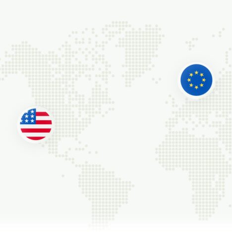
When we first introduced the product, we leaned into a more playful and approachable identity, using familiar shapes and an expressive character to make a technical problem feel simpler. As the product matured, handling redirections and SSL certificates for over 9000 domains, so did its role, and with it, its identity.
The new version reflects that evolution: more refined, more focused, and built around trust, clarity, and reliability.
The redesign preserves NakedSSL’s recognisable character while bringing more focus, technical precision, and reliability to the system.
A strong green palette, paired with earthy grey, creates a balance between clarity and trust. To contrast the expressiveness of the colors and forms, we introduced NB International as a new Typeface to add structure and confidence to the identity.
Locky evolved into a sleeker, more dynamic form, both as a flat icon and through a new chromatic 3D treatment. From that evolution, a new counter shape emerged – reappearing across loading states, highlights, bullet points, and motion patterns to bring a more cohesive sense of brand expression into the product.
Together, these elements create a richer and more mature visual language: one that remains approachable while feeling more dependable and refined.
Approach
The goal of the redesign wasn’t just visual refinement, but visual alignment — making sure the identity fully reflects what NakedSSL stands for.
We reviewed the existing system across brand assets, typography, colour choices, and feature communication to identify where the experience lacked cohesion.
The outcome is a more unified direction that brings consistency to type and colour usage, clarifies Locky’s role, and introduces supporting shapes and layout principles that make the product feel more connected overall.
Impact
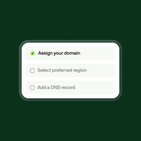
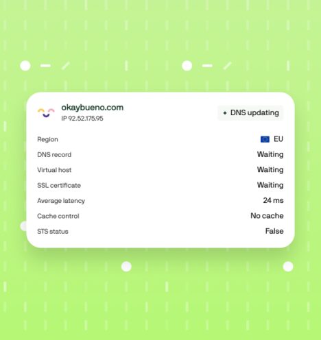
The redesign went beyond visuals. Clearer self-service flows now help users identify misconfigurations, troubleshoot issues, and resolve setup problems with greater confidence.
Early trial data suggests a positive impact on conversion, with an estimated uplift of 20–30%. The focus throughout was simple: reduce friction, use technology where it adds real value, and make the product easier to trust.
Summary

As our product evolved, it became clear the old foundation was holding us back. Taking a step back and rethinking both the visual and technical implementation gave us the speed, flexibility, and experience our users expect today.
Jesús Espejo
Founder & Partner at okay bueno
Have another SaaS business in mind? Let's venture up:
Next
